Redesigning Your Logo: Main Considerations
Your company is going on its 12th year in business. It’s been a very successful run, marked by consistent growth year after year. You’ve also added several products and services. While you’re still servicing a niche market, your customer demographic has also changed, and now includes many young people who have significant buying power.
You need to relocate to a new and bigger space in Melbourne. This move is a big project and requires everyone’s assistance. New furniture, equipment, decorations, and other office fitouts would have to be incorporated into this relocation project.
The growth and this move also allow you to re-invigorate your branding strategy. Everyone agrees that the new branding should reflect the new product line and the expanded customer base. Your focus is on creating a new logo. What are some of the considerations?
Why Redesign Your Logo
Nothing speaks more loudly about your brand than your logo. Your logo conveys your core company values and reflects the strength of your product and services.
Companies like Nike, Shell, or Volks Wagen, created very logos that remain relevant today. But a small business with expanded products and services should revisit their logo design to ensure that they stay ahead of the competition.
A new and younger customer base might necessitate a logo redesign as well. Your design must adapt to the times and be able to communicate with both loyal and new customers.
New players are always coming along. They’re hipper, more modern, and able to attract young customers immediately. Make sure that you will not be ignored because your logo is outdated. Get into their game and design a modern logo.
Considerations in the Digital Age
Before, you only need to make sure that your logo looks good on your letterheads, brochures, business cards, product packaging, and your office door. Now, you need to consider how your logo would appear on your website, and its look on multiple devices like PCs, mobile phones, and tablets.
With many transactions taking place on mobile phones and other portable devices, logos must be impactful as icons on these devices. Because of this, you need to adopt a squarish looking design over a more horizontal or vertical one. Good examples of these logos are the ones for Spotify and Waze. Your logo needs to be a good favicon too on web browsers.
Likewise, they need to look good in big formats like the signage in your lobby.
The KISS Principle
KISS stands for Keep It Simple Stupid! Too many colors, graphical images, or too many fonts confuse customers rather than entice them. The goal is to make it memorable and unique. If it’s simple, it’s going to look good on mobile devices.
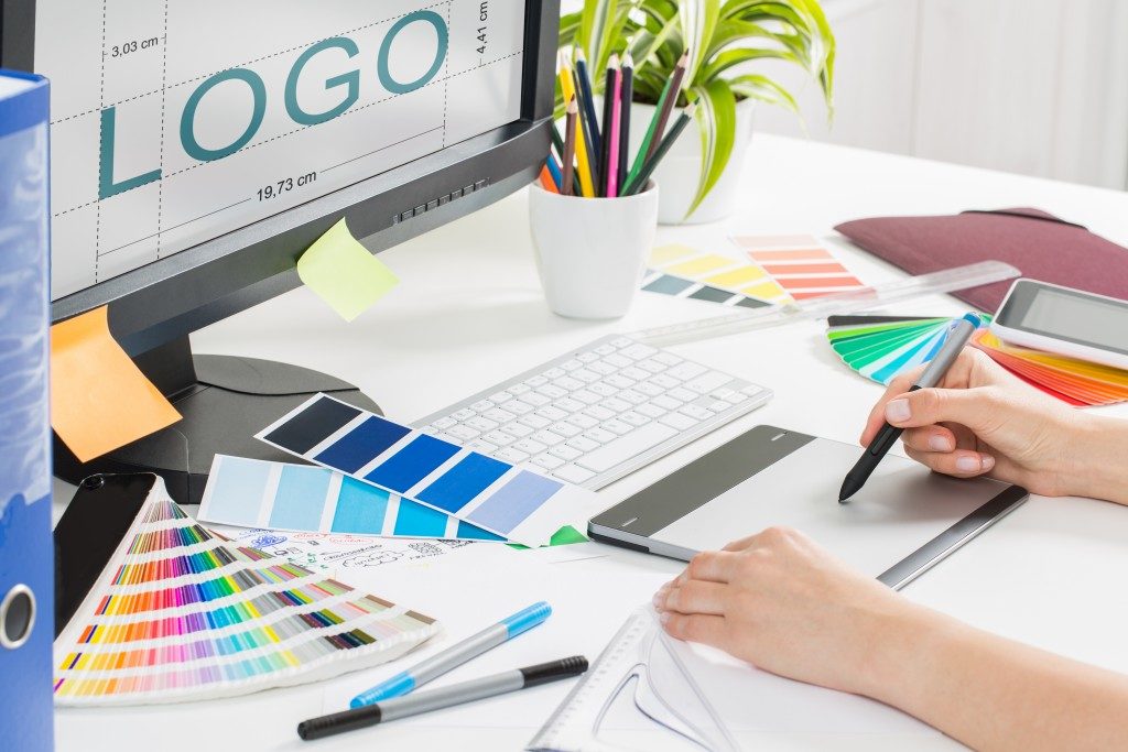
Decide on your color, image, and font scheme. A two-color scheme is an excellent way to go. Pick colors that are relevant to your values and product. Blue speaks of “trust” and “tranquility” while red evokes “passion” but also “anger or excitement.”
It would be prudent to hire the services of a professional graphics designer to help you hurdle the challenges of designing.
Transitioning
Finally, once the design is completed, you need to decide on your transition plan. Will you gradually introduce the new logo over time? Or will it be a quick one-day-to-the-next kind of transition?
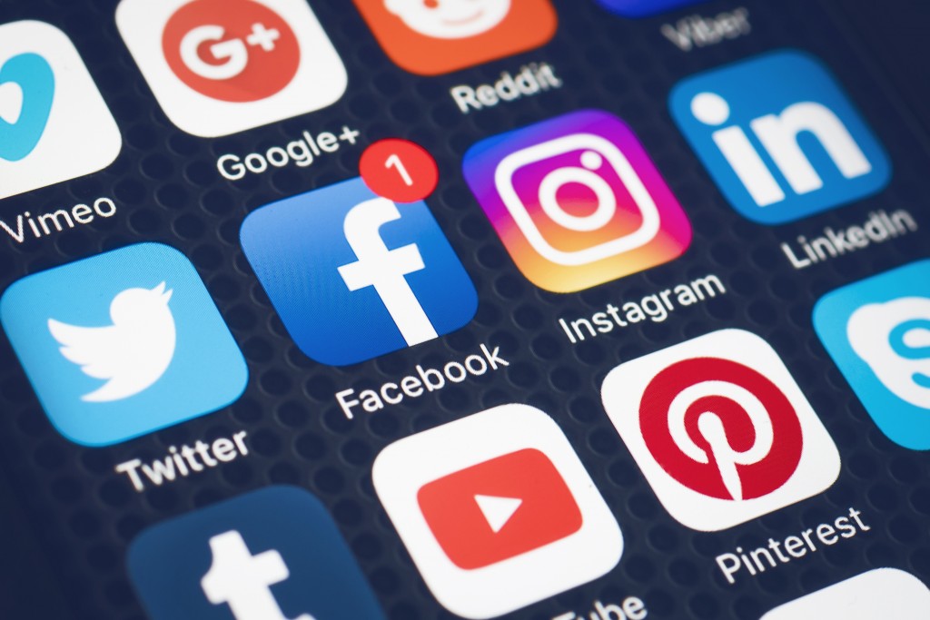
Note that you would have to update multiple items from business cards and letterheads to your email signature and social media presence.